Your front yard: pristine. The manicured lawn, the blooming flowers, the carefully placed lighting that showcases all the details of your architecture. But is your home’s first impression letting you down in one important way? Shut the front door. It’s time for an upgrade. Whether you’re in a New York brownstone where the front door is easily viewable from the street or a California estate tucked behind gates and at the end of a private drive, you have an opportunity to make a statement just by choosing the right paint color. We’re taking a look at some of the most recommended color choices to give your house a pop, help it stand apart, and make you smile every time you come or go.
Green

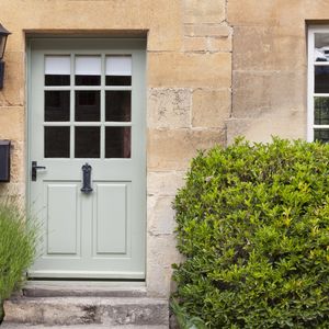
Light green wooden doors in an old traditional English lime stone cottage surrounded by climbing pink roses, lavender, on summer day
What’s the story: Mint, sage, avocado, emerald, forest, hunter—the range of greens is vast. But no matter the shade you choose, when it comes to your front door, it’s easy being green. At least according to the principles of Feng Shui. Green’s popularity as a front door color can, at least in part, be attributed to its symbolism. As the color or money, green is associated with wealth, but it also imparts a freshness, and a feeling of growth and expansion, balance, healing, and renewal. What it looks good with: Depending on the shade, green can complement nearly any type of architecture and any primary exterior color. Drawing inspiration from your landscaping for specific shades is one way to choose the ideal green hue. Want a deep, rich shade? Farrow & Ball’s Duck Green, “named after the deep green plumage of a mallard…is a wonderful reminder of the exquisite colors of nature,” says the company. Energize a contemporary home or bring a focal point to a wooden or brick exterior with Sherwin Williams’ electric Center Stage. Benjamin Moore’s Greyhound is a favorite shade that allows you to go green in a more subtle way.Yellow
What’s the story: T.S. Eliot spoke of yellow fog in The Love Song of J. Alfred Prufrock, a reference that was widely thought to be symbolic of love. Yes, yellow brings the love, along with its sunny disposition and unbridled optimism, to your home’s entry. But that doesn’t mean it can’t also look sophisticated. Farrow & Ball’s Dayroom Yellow is the perfect pale shade for just a hint of sunny color. On the other end of the spectrum is English Yellow, a bright yellow Chalk Paint from Annie Sloan that was “inspired by the development of Chrome Yellow pigment—the first non-earthy yellow used in 19th Century English drawing rooms—as well as the yellow found in Chinese hand-painted wallpaper,” says the company. What it looks good with: Just about anything, really. Avoid bumblebee comparisons by staying away from black and pair yellow with white, gray, blue, or brown. Yellow offers a worthy complement to warm woods and a pop of color against a neutral, classic coastal or traditional showplace. It’s also an elegant accompaniment to traditional red brick and an ideal foil for midcentury modern architecture.Orange
What’s the story: Orange may not be the expected choice when it comes to your front door, and that’s precisely why you might want to consider it—especially if you’re looking for a way to make your home’s exterior infinitely more memorable. Orange is warm, bold, and daring, communicating happiness and positive energy. Our choice: Farrow & Ball’s Dutch Orange, “a clean bright orange with the ability to enliven any space,” says the company. Think pumpkin crème pie, not pumpkin patch. What it looks good with: Cool colors like blue, gray, and green. Orange looks striking against white wood or stucco exteriors and light-colored brick or stone. Beware of orange against black trim, for obvious reasons: You don’t want to be known as the Halloween house all year round.Black
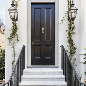
 What’s the story: Speaking of black…a black door is regal, dramatic, and chic. The principles of Feng Shui suggest that it imparts protective energy as well as elegance and calmness.
According to an analysis of different paint colors by Zillow, black has the highest potential for increased value of any front door colors. Their study, which was based on older homes, showed that a black front door can command a price increase of 2.9 percent.
Black Tar (2126-10) by Benjamin Moore is a highly saturated black that is a favorite of designers like Nicole Hollis. One of Architectural Digest’s AD100 designers for 2021, Hollis didn’t just use the color on her front door, but rather the entire exterior of her Italianate San Francisco home.
Sherwin Williams Tricorn Black in a high-gloss finish is a favorite of designer Shea McGee of Studio McGee, for a “statement-making front door.”
What does it look good with: Black creates drama wherever it goes. Use it for maximum contrast on a white farmhouse or against other light or neutral shades. Black makes a striking focal point on a natural wood exterior and works equally well on contemporary, mid-century modern, traditional, or craftsman/bungalow-style homes.
Blue
What’s the story: A blue front door can create a sense of calm and tranquility and also symbolizes prosperity. Wythe Blue is a former Benjamin Moore “color of the year” that has remained a favorite as a “beautiful, calming hue that has an element of heritage and offers grounding rootedness, providing comfort and stability,” the company said in its Color of the Year announcement. The blueish-green shade “evokes the sea and sky, physically calms us, and symbolizes trust and commitment.” We love this turquoise shade from Donald Kaufman Color, created as part of a custom color collection inspired by Doris Leslie Blau rugs. Go deeper with Hale Navy by Benjamin Moore or Farrow & Ball’s Hague Blue, which introduces green undertones in a more dramatic way. What it looks good with: Blue works with just about anything, whether you are using it on the door and trim of a multi-hued Victorian estate, contrasted against white or light gray, or as a pop against a natural wood, brick or stone exterior. Traditional, modern, and everything in between, nearly any house looks stellar a pop of blue at the helm.Red
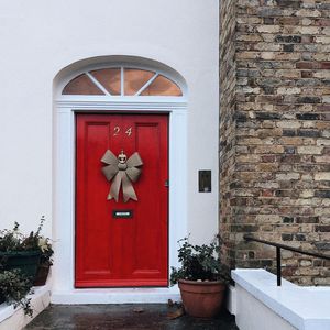
 What’s the story: If you want to, quite literally, roll out the red carpet to your home, paint your front door a shade of crimson. Stories abound that American families in horse-and-buggy times would paint their front door red so weary travelers would be able to recognize welcoming homes in which to stop for rest. Red doors continue to symbolize a welcoming spirit and are also thought to bring good luck in Chinese culture.
Ruby Red by Benjamin Moore is a highly pigmented, true red in the vein of fire trucks or crisp apples. Farrow & Ball’s Rectory Red is intense and sophisticated in a “Welcome to my restored 18th century manor” type of way (Its name was inspired by village houses built for clergy over the years.).
What it looks good with: Nothing beats a crisp white house, except, perhaps, a crisp white house with a bold, statement door in unapologetic red. The color also looks great against gray and other neutrals as well as natural wood tones.


